
1. Rebrand – quite an extreme sport and some indicators to kick off
Despite not being a new phenomenon, rebranding has scarce literature surrounding it, and thus, the common definition has not emerged.
In a book Strategic Brand Management, Keller (2013) defined rebrand as identifying new sources of brand equity and therefore increasing brand awareness and image. To put it simply, rebranding is to change the way an organisation is perceived by its target audience. This process involves mapping out new brand strategy and creative strategy to reflect business goals and eventually visualizing and announcing this reinvent by a new identity.

Some surface level changes are not rebrand
Rebrand is an indicator that a brand is moving into a new direction. Note that some surface level upgrades, for example a new brand design, are not called rebranding!
So, when does a brand need to be rebranded? The determination to embark on a rebranding journey is not easy if you go deep into it and do it right, not simply make some visual refresh. That’s why there is no straightforward answer to the question “when” except for extreme situations or significant shifts in your business.
To be more specific, when you are in the following cases, it might be the time to kick off a rebrand journey.
From internal side:
- Your business has experienced substantial change in business model, core offerings, competitive strategy,…
- You’ve outgrown your brand. What you are today and more importantly what you desire for tomorrow is not relevant to the existing brand core.
- You haven’t invested sufficiently and wisely in branding from the dawn of your business, and now you see clearly the disconnection between your perceived brand and the company’s spirit.
- You’ve undergone a merger

Internal indicators for rebrand
From external side:
- Your core audience has changed or is constantly changing in psychology and behavior and the current brand does not resonate and inspire them.
- The competitors are evolving rapidly and your brand lost its advantageous position or is considered dull and outdated compared to them.

External forces to rebrand
Besides the above cases, some companies even perform a rebrand when there is transformation in leadership or they need a rebirth as an attempt to distract from the recent criticism.
Identifying the ripe time for a rebrand is a matter of life and death because the worse thing than deciding not to conduct one when you should is you dive into it when unnecessary.
2. Rebrand process – fundamental steps involved
As you can see, rebranding is a risky and grueling journey. It thrives if you go right or it can also become disasters, say Gap rebrand for example. Despite whatever direction you set for your rebrand, some vital stages should be involved.

Firstly, at the trigger phase, a well-defined business strategy has to be ready in hand. As mentioned earlier, rebrand is a reflection of business goals, so first, you need to establish a solid business direction for your company in the transition phase. Remember to identify business reasons for rebrand.
Next, at the review phase, a brand audit (link to BHC service page) should be conducted. This activity helps you to properly assess the current state of your brand. This broad and in-depth evaluation is an essential input to the next step to form a revolutionary direction for your brand: what can you inherit and what should you improve or shift?
Then, a new brand strategy is developed at the strategic phase to make sure that your rebrand won’t be led astray. At this stage, you gain a deep understanding of the current situation according to 3 angles – your target audience, your competitors and your company and come up with idea to differentiate your brand sustainably.
Read more about the 3C model to design brand strategy here!
After thoughtful brand strategy is established, a creative strategy is drawn up to visualize your brand core truly and impressively. At this creative phase, your brand design is sharpened and refreshed to powerfully convey a new you to your target audience.
And finally, at the activation phase, you launch a campaign to activate and promote your new brand.
As you can see, a fresh and innovative brand design is only one step at surface level in the rebrand process. Behind this, complex and struggling progress needed to be conducted.
3. Airbnb – a successful rebrand case study
Now, we dig deep into a fruitful rebrand case to gain a practical view of the rebranding process.
Business growth and existing brand assessment
Airbnb is a company operating a marketplace for hosting and lodging for vacations and tourism. It was born in 2007 when two hosts – two out of three founders – welcomed three guests to their San Francisco home just for a bit of extra money to make rent. Then, in June 2011, they began their international expansion with the opening of their German office.
After that, the company realized that the business and community have outgrown their originally established brand at exceptional speed thanks to its innovations in accommodation model. It was no longer an online platform for booking and renting rooms in the US. It has built up its community in other country and more importantly, it desires to expand the community globally and offer unforgettable experiences to the hosts and guests.

Business outgrowth of Airbnb led to rebrand
Looking at the Airbnb brand at this time with irrelevant brand core and temporary brand identity – an overnight rush job by Airbnb co-founder Joe Gebbia, the company knew that they needed to start their rebrand.

Airbnb old logo before rebrand
Brand Strategy
In 2013, Airbnb cooperated with a global agency to bring about a revolution for the brand. They started the journey to find the heart and soul of Airbnb and its differentiator.
After thorough research and hands-on experience with hosts of Airbnb around the world, the team clearly confirmed that Airbnb’s line of “a place to stay” was selling it short. Airbnb’s aesthetic value is all about people – connection and culture: guests feel home with warmth and welcoming and hosts could connect with people around the world from their home. When you feel home and all the interaction takes place at home, everyone feels belonging to the place. “A house is just a space, but a home is where you belong”, said Airbnb CEO Brian Chesky.

Belong anywhere spirit of Airbnb
That’s why the “belong anywhere” idea truly defines Airbnb and resonates with long-term vision of Airbnb.
Creative Strategy and Execution
Having the “belong anywhere” idea as the lighthouse, what they needed to do next was figuring out a creative strategy to powerfully represent and convey Airbnb’s community spirit to the world.
As Airbnb CEO Brian Chesky shared, at that time, they defined that they need a global symbol to represent the belonging value of the brand. This symbol has to mean belonging in any language and any culture. They wanted their symbol to transcend all geographic and cultural boundaries to be understandable and recognizable over the world.
From this direction and inspiration from German designer Kurt Wiedeman’s theory that a great logo “is ‘something you can draw in the sand with your toe”, Belo symbol was born.
The Bélo illustrates the form of an upside-down heart or a paper clip symbol, which also looks like the letter “A”. It was designed to represent four things: people, place, love, and the “A” of Airbnb.

The Belo symbol in combination with the new color palette purely reflects Airbnb’s warm, welcoming and open hearted spirit.

About brand photography, instead of showing whatever kinds of spaces, photography and film boldly captured the people and places that make connections and memorable experiences happen.

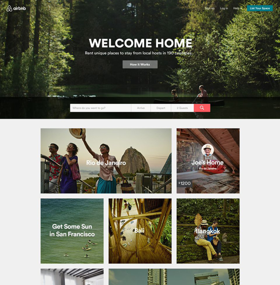
Besides a complete brand guideline, a totally fresh, smooth and consistent brand experience was also introduced with a new website, IOS, and Android apps, conversation’s tone of voice,…

Some successful results
The Airbnb rebrand went viral on Twitter. Nearly 20,000 people have already used create.airbnb to create a unique version of the symbol specifically for them.

It also helped to propel Airbnb’s valuation to $29 billion above their closest competitor in less than four years. On its first day of trading at the end of 2020, Airbnb’s share price more than doubled the $68 per share price set for its IPO the day before, giving it a market valuation of around $86.5 billion, far above that of travel titans Booking.com and Expedia.
Conclusion
Conventionally, talking about rebrand, the public only notice and discuss the change at surface level of the brand – its new visual identity. However, more tough and complicated things lie under.
Your brand always comes along and develops with the transformation and revolution of your business. So, when something with your brand goes wrong or is not up to your expectations, it’s highly possible what you should do is not with your logo but something goes deeper into your core.
Because of that, how we work is unlocking deeply into you to explore things you haven’t even known about you. Our expertise is not only in design and brand but also in…you!


