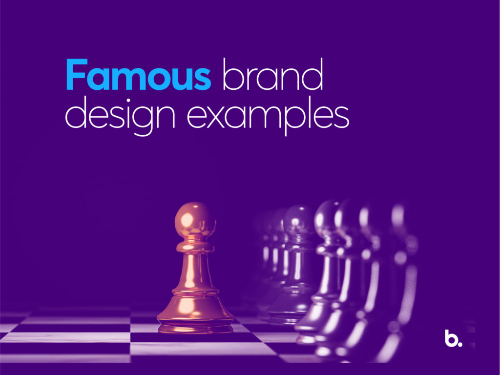
3 famous brand design examples with strong visual identity
A bad first impression is hard to shake, especially when you’re competing against millions of contenders online. Within 0.1 seconds, people form judgments about the likeability, trustworthiness, competence, attractiveness, and aggressiveness of faces in photos they were shown.
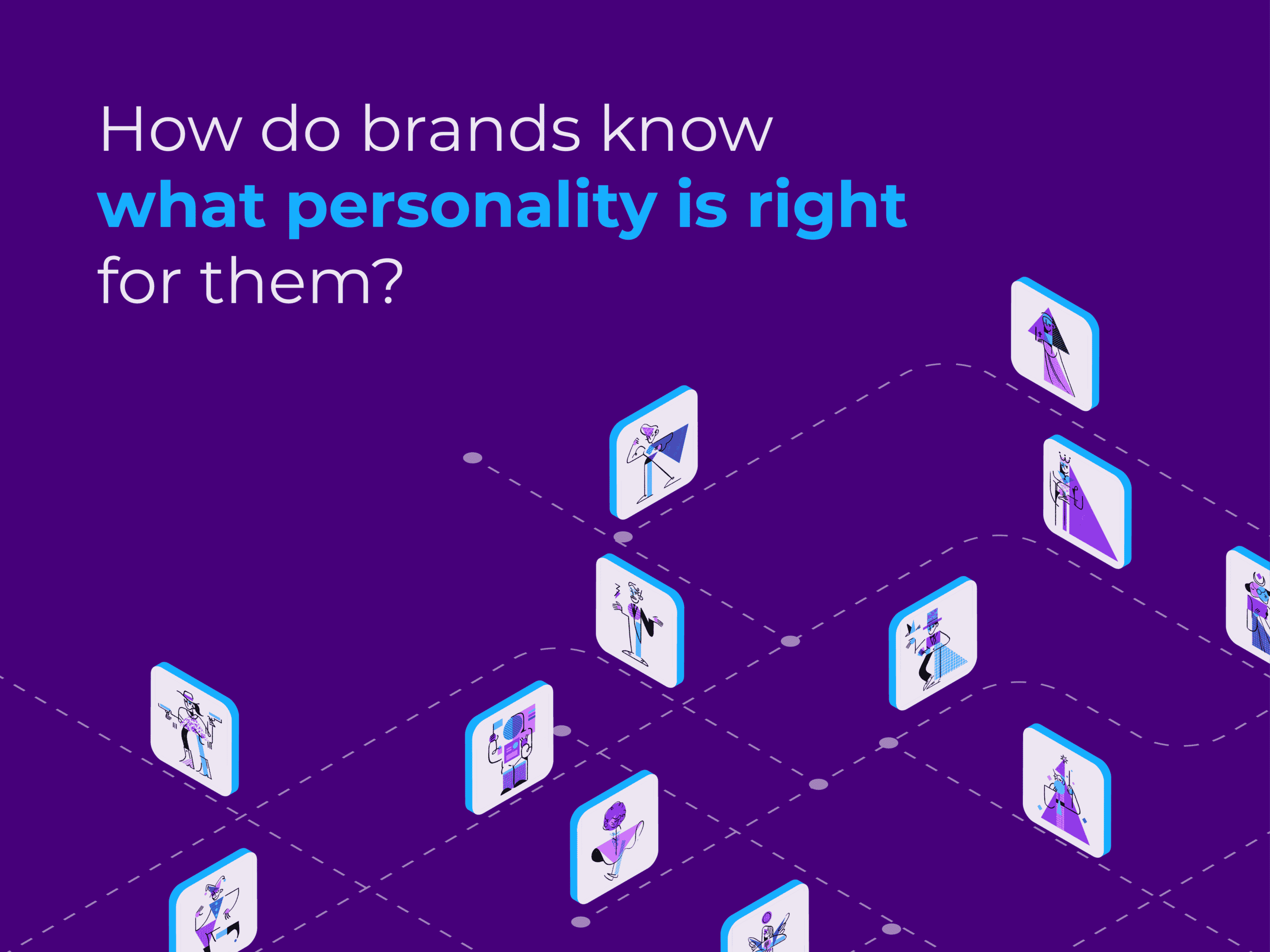
What judgment will people form about your brand in the first 0.1 seconds of exposure actually depends on your brand visual identity. What exactly is a strong visual identity that evokes impressive and authentic feelings from customers? Let’s discover some famous brand design examples to find the answer!
1. What is a strong visual identity?
Visual identity comprises your logo, imagery, typography, colors, and creative design. It’s easy enough to list them out, but how do you get to the heart of how these elements communicate to your customers who you are, what you stand for, and why they should be loyal to you? That’s why we have to think about a strong brand visual identity!
Strong visual branding means instantly telling people who you are, what you’re doing, and why they should want to engage with you. The strong visual identity makes the brand utterly unique, purposeful, and long-lasting. A strong brand identity should be: distinct, relevant, extendable, memorable, and consistent. You can understand better what and how strong visual identity is by looking at some famous brand design examples below:
2. Examples of brand design with strong visual identity
Airbnb
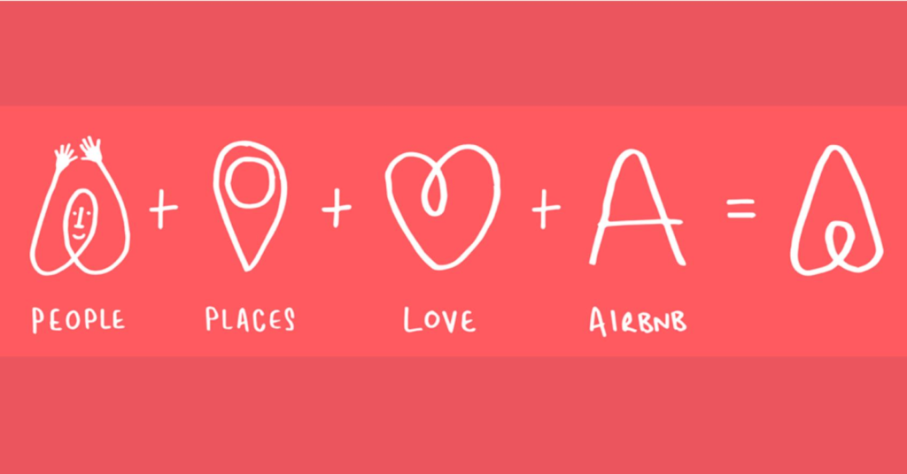
Meaningful logo of Airbnb
Airbnb’s strongest identity comes from its new brand logo.
At the time of rebranding, they released a new logo which was put together by associations from the elements: People, Places, Love, and the final logo is formed as an A – the first letter of the Brand Name: Airbnb!
A fairly simple logo that shows the spirit of Airbnb very clearly.
With this logo, Airbnb wants the world to understand why the company is started and the message they want to deliver.
Airbnb wants to build a community with a sense of belonging. Instead of just traveling or visiting, Airbnb wants its customers to find a truly new home everywhere they go, so that they themselves clearly feel the message coming from Airbnb’s “Belong Anywhere” tagline.
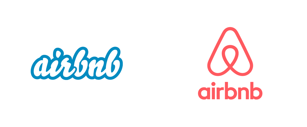
Logo before and after Airbnb’s rebranding
A new website was redesigned to create an online community where hosts can share their favorite local spots and explore Airbnb locations and Guests can share stories and reviews of locations where they have stayed.
Now, when people think of Airbnb, they think of discovering somewhere new and belonging to another part of the world.
The letter “A” and the red-pink on the logo successfully express all these above things.
Simple but sharp, it’s exactly how a strong brand identity works.
Netflix
Appearing as a pioneer for online streaming, Netflix perfected a memorable yet impressive brand design – with the aim of quickly becoming the “top of mind” of users. And Netflix succeeded.
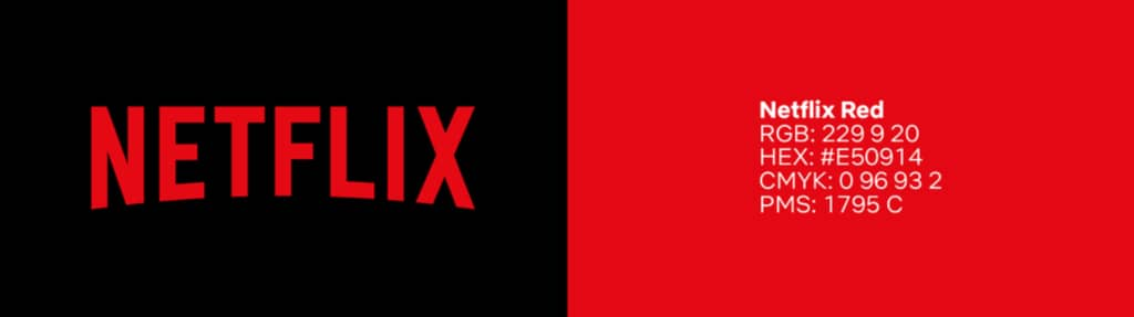
Modeled after CinemaScope’s logo from the ’50s and ’60s, the Netflix logo is represented by exactly one color code – “Netflix red” on a black or white background. The Netflix logo with a red “N” reinforces the company’s visual identity and makes it one of the most recognizable brands on the planet.
According to the Global Brand Simplicity Index, Netflix is ranked as the simplest brand. Although simple, this Netflix selection is not over the top, it is very carefully calculated and smart. Let’s explore those smart calculations with Bon!
Netflix believes that simplicity is at the core of a positive user experience. As a result, they simplified the user journey on a parallel platform with simple bold red text on a black background. That symbol does a great job in evoking a clear picture of a simple but positive experience.
Besides, the beauty of simplicity in Netflix’s logo design is its versatility. That icon is easy to zoom in and out, flexible in any medium, making it easy for Netflix to adjust the image when it comes to the brand and get the prominence it wants.
Sometimes, suitable is better than “beautiful but hard to handle”
PayPal
Launched in 1998, PayPal has gradually become an innovator and leader in digital payments, operating in 25 national currencies.
Compared to PayPal’s position in the market at the time, its initial identity was as a desktop web 1.0 era design. At this point, PayPal needed to conduct a comprehensive visual review to design a new identity that would address key brand challenges, standing out in an area where there are so many potential competitors.
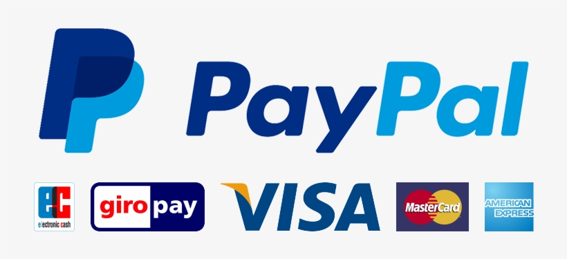
PayPal changed the white text to the blue version in 2007 and updated it with a sharper image in 2014. The latest PayPal logo is modern, bold, and youthful with a combination of 2 elements:
- The double P “monogram”, this image implies the connection, getting closer together, showing the ability to pay for the multi-country of the application value.
- PayPal word in italics next to the double P helps the brand show its transition to the future, affirming the spirit of forward-thinking, and never settling,…
The two elements mentioned above successfully capture the spirit of connection and transition – two important things a digital payments brand needs to maintain.
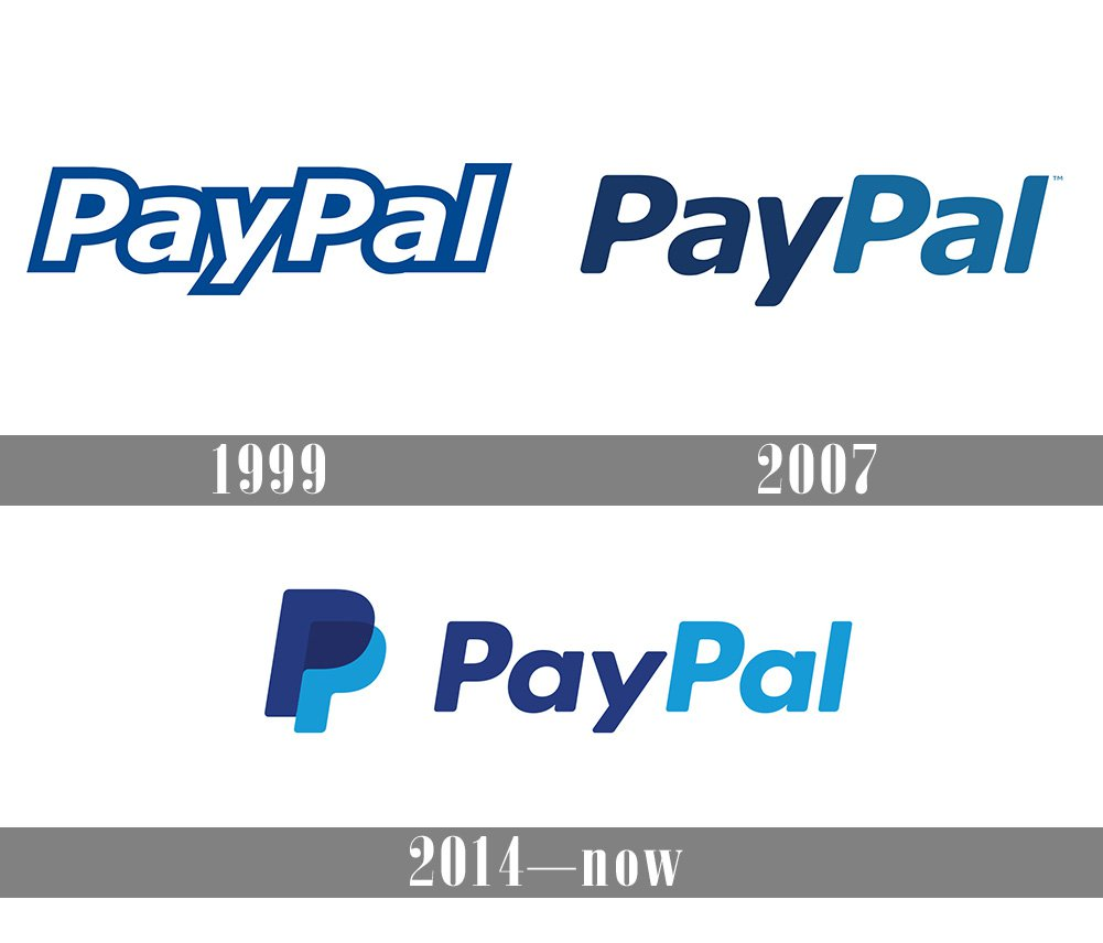
Another thing worth learning about PayPal comes from completely changing both the logo and font but still keeping the blue color – the color of trustworthiness and reliability. A fresh, lively, more enthusiastic image but still retains the core values of a brand that needs prestige. PayPal Typefaces is also a classic sans-serif typeface – improving legibility. This is like the PayPal brand itself, sharp and modern, but friendly and approachable.
In PayPal’s case, people have a message which they have to remember when creating a Brand Identity: “Meaningful and express as much value as possible.”
3. Coming down to a few simple things
Have you noticed that brands with the strong visual identity we discuss above all possess clear, vibrant, and specific personalities along with well-defined core values? The creative design actually helps them to powerfully and truly communicate who they are from inside to the world outside.
So, if right now or someday, looking into your brand visual, you feel it’s not strong and outstanding enough, perhaps what you need to do first is not find a studio to upgrade your look but explore deeper into your core and figure out its differentiator.
That’s why in devising strong and unique brand design, before having our creative mind and design techniques perform their job, we always invest a great deal of effort to listen to your heart and soul.